The steps taken to review, refine and document an improved in-app insurance purchase flow.

Alex BB.
Founder, Visual Binary
Context
Caura is a mobile app that lets UK drivers pay vehicle tax, insurance, MOT, tolls, parking & more.
During my time at Caura, it was our mission to synthesise complex and often tedious processes of existing workflows into simple, slick experiences.
(how do you make paying vehicle insurance sexy?)
The insurance purchase journey was the longest end-to-end flow inside the Caura app, with 120+ unique screens.
In 2024, I was tasked with streamlining the journey, to make the process take an average user less than 5 minutes start-to-finish. Here is a brief overview of that process.
The process
Because the insurance flow was a beast that had been worked on initially in 2019, with improvements layered on throughout, there actually wasn't a definitive source of truth that documented all possible screen variations when I started looking at the journey.
My first step was to conduct an 'interface audit' - ensuring we had the entire user journey, accounting for all possible interactions, documented in Figma.
This task required rebuilding a lot of old screens, that had never even been designed properly in the first place, and had been constructed by engineers when dealing with edge cases.
Once we had the entire journey documented, it was possible to 'redline' the flow; identifying steps and actions that could be removed, combined or streamlined.
One key example: the number of questions a user had to manually input could be reduced by 20%, if we brought forward the driving licence step and used the up-to-date information provided when we fetched the user's licence data throughout the rest of the form.

Part of the documented insurance flow
Once we had refined the journey, another key task became documenting all possible variations of a screen, in a way that was easy to comprehend by the engineering and operations teams.
The result was a 'screen matrix', which tabulated all possible states a given user's screen could be in, to help anyone viewing the Figma design easily understand all possible scenarios.
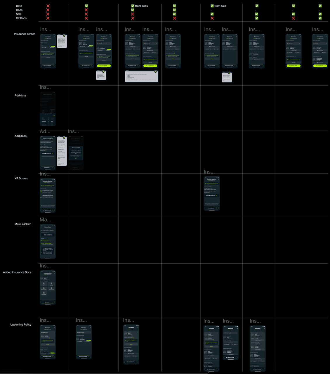
Matrix breakdown of permutations of one insurance screen
The final step was to then really dive in to the craft and detail of each screen. To use the chance of this UX overhaul to really put some care and attention into each and every pixel, word and interaction.
The result was some pretty interesting design patterns, like the progress indicator button, which were being applied to the Caura app for the first time.

Screen that shows user's progress through flow
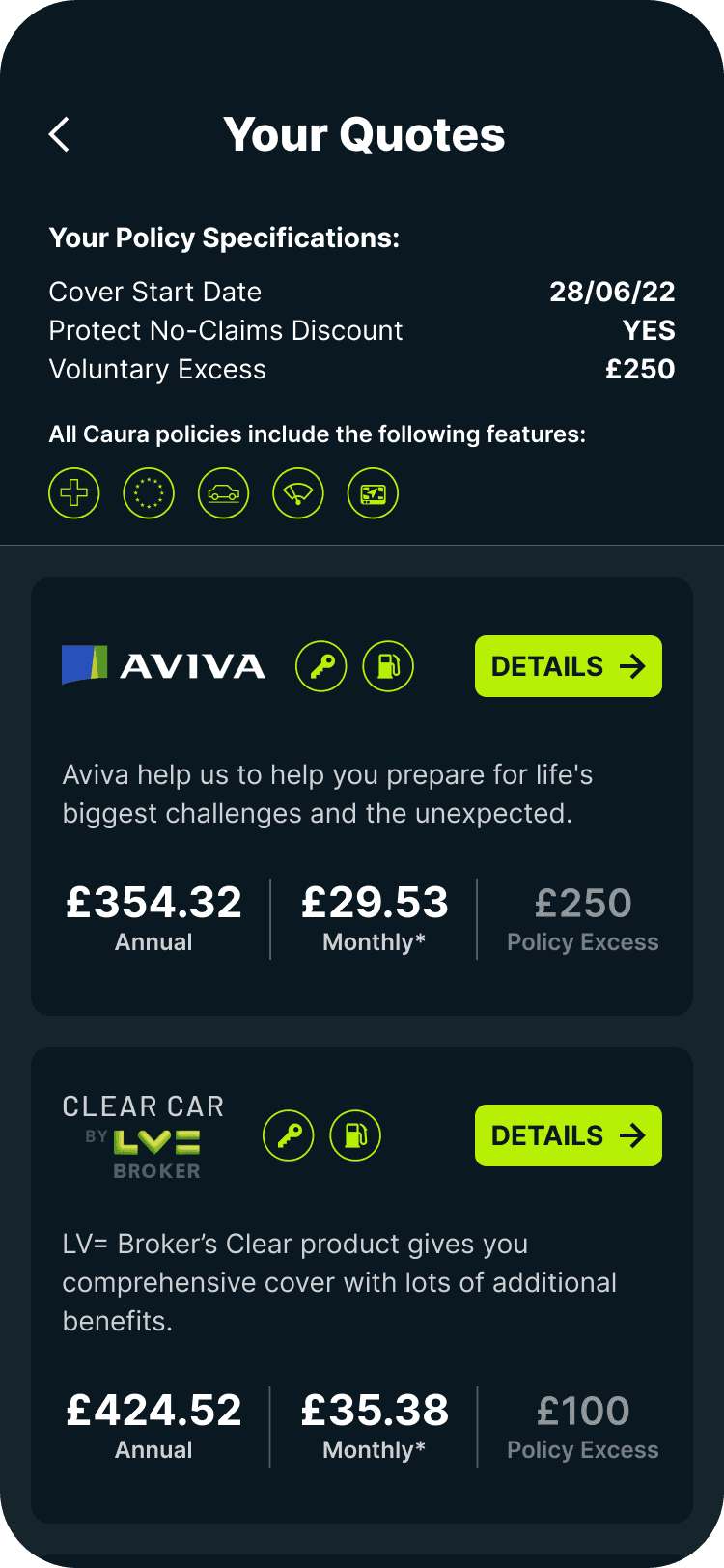
Screen that shows breakdown of quotes
Results
We managed to streamline the 120+ screen journey into just 40 distinct screens, with different accompanying 'variant matrices' to demonstrate possible user states.
In the end, we also hit the key goal: allowing users to complete the entire journey in an average of under 5 minutes.
Fin.